Cybersecurity website design has come a long way from the stereotypical black-and-red hacker aesthetic.
For years, founders assumed that a dark themed website with scary looking graphic elements and a sinister ambience automatically reflect that you’re a professional and highly technical cybersecurity team and therefore very “secure” or “advanced.” But over the past few years, and as we now move into 2026, that’s no longer the case.
Today, the best cybersecurity websites are clean, fast, and visually calm.
They balance confidence with clarity – focusing less on flashing grids and 3D animations, and more on readability, trust, and ease of understanding.
Today, the visitors aren’t always security experts; they’re most likely business leaders, compliance officers, or IT managers looking for assurance and simplicity.
They want to first understand if you fit their requirements and then be impressed by your website, if at all.
A good cybersecurity website, therefore, has a single job: make complexity look easy.
That means:
- Big, readable headings for stressed visitors who arrive after a breach.
- Lightweight pages that load fast – because speed signals credibility.
- Consistent visuals, clean spacing, and restrained motion.
And cybersecurity website design today isn’t binary anymore.
Some brands, like Zscaler, Cloudflare, or Drata, use light, minimalistic interfaces to convey stability and compliance. Others, like CrowdStrike or Darktrace, use dark neon gradients to express technical strength and AI readiness.
This blog lays out a simple framework for thinking about modern cybersecurity website design – how to balance aesthetics with clarity, when to go minimal versus techy, and five design examples that define where the industry is heading in 2026 and beyond.
A Framework for Modern Cybersecurity Website Design
A strong cybersecurity website design starts long before you pick colors or animations. It begins with understanding what your audience needs most: clarity, trust, and the confidence that your product can reduce risk without overwhelming them.
Below is a refined framework, now with accurate category context for each example.
1. Clarity Above Everything
In cybersecurity website design, your message clarity becomes the first and most important credibility signal.
Companies like Vanta and Drata have mastered this. As compliance automation platforms, they lead with simple, declarative messaging:
- What they automate
- Who benefits
- Why their approach is safer and faster
They do not hide behind metaphors or hacking imagery. They rely on structure and language to translate complex workflows into something business leaders can instantly understand.
This is the core of cybersecurity website design best practices:
Clarity builds trust faster than aesthetics ever will.
2. Simplicity That Reduces Cognitive Load
Cybersecurity is inherently complex. Your website shouldn’t be.
This is exactly why Delve, a GRC platform, stands out. Because GRC buyers care about clarity, order, documentation hygiene, and ease of navigation, Delve’s design intentionally removes distractions. The palette is white and airy, the spacing generous, and the visual system quiet — signaling control, stability, and audit maturity.
And as a contrast, look at offensive security brands like Synack. Despite operating in a niche that traditionally relies on dark hacker tropes, Synack avoids clutter and cliché imagery. Their layouts are clean. Their typography is strong. Their visuals are modern and restrained.
This split illustrates an important truth in cybersecurity website design:
Your design should reflect your product category — not stereotypes.
- GRC → clean, calm, documentation-friendly
- Pentesting / Offensive Security → minimal, technical, but not chaotic
- SaaS security → balanced, modular, highly readable
Simplicity, today, is strategic communication.
3. Speed and Performance Signal Security
Nothing undermines a cybersecurity company’s reputation faster than a slow website.
This is why Cloudflare is a model for performance-driven design. Their site loads instantly, animations are lightweight, and the UI reflects the product promise: fast, globally distributed, reliable.
And speed, more than ever, has become an important factor to get user’s attention quickly. The flip side is users are less likely to revisit a slow website again.
Plus, a fast cybersecurity website subconsciously also tells the visitor:
“This team knows how to build high-performing infrastructure.”
Modern cybersecurity website design best practices call for:
- Optimized SVG illustrations
- Limited use of heavy hero videos
- Clean CSS transitions
- Minimal JavaScript complexity
Your website’s performance is an integral part of your brand positioning.
4. Visual Consistency Builds Credibility
Security buyers are trained to look for gaps. Inconsistency is a gap.
Zscaler is a great example of visual consistency done right. Their typography is disciplined. Their layout system repeats predictably. Their navigational patterns are familiar and stable. The color palette doesn’t fluctuate every scroll.
This is why their website feels enterprise-ready.
Their consistency feels more like psychological reinforcement.
Consistency throughout the website doesn’t just show that you’re extremely professional but also reflects your attention to detail, and technical rigor towards your brand messaging.
5. Mood Matters: Technical Strength Without Intimidation
Your website’s mood conveys your positioning long before your content does.
For technical, AI-driven detection platforms, a darker interface can work – but only when used with discipline. Darktrace executes this perfectly. Their gradients are subtle, their neon accents purposeful, and their motion controlled.
It feels like a modern AI system – not a Hollywood hacker cave.
Meanwhile, compliance and SaaS workflows favor light and modular aesthetics because they communicate transparency and reliability.
Modern cybersecurity website design isn’t really about “dark vs light.” It’s more about choosing a design mood that:
- Supports your product category
- Builds user confidence
- Reduces visual friction
Light vs Dark Themes: The New Rules for Cybersecurity Website Design
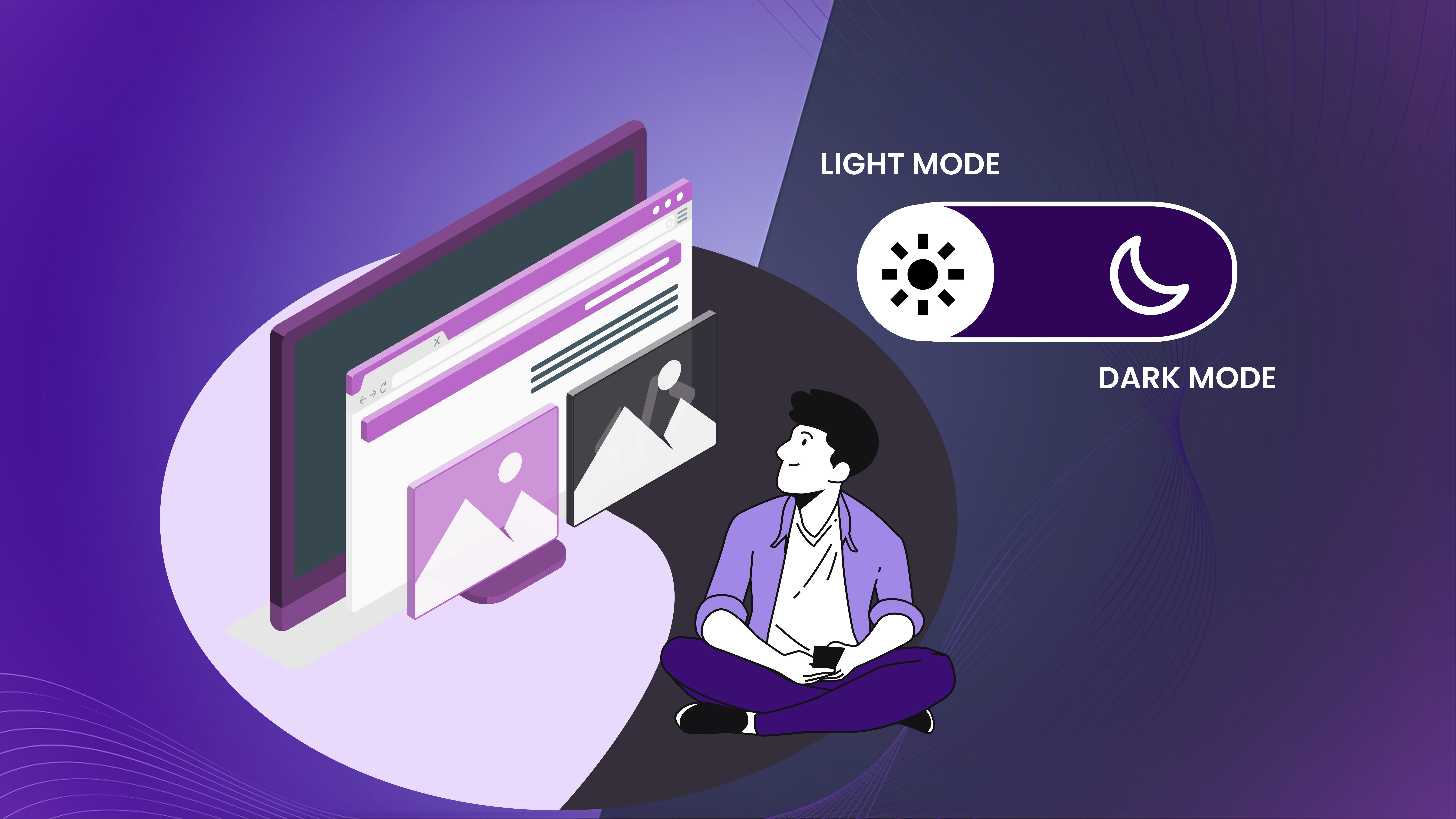
1. When a Light Theme Makes More Sense
Light-themed cybersecurity websites are becoming the default for products where clarity, transparency, and workflow comprehension matter more than visual drama.
Light themes excel for:
- Compliance automation platforms (Vanta, Drata)
- GRC tools (Delve, Hyperproof)
- Security posture management dashboards
- Risk & audit platforms
- Business-facing cybersecurity SaaS
Why? Because light UIs naturally communicate:
- “Nothing is hidden.”
- “This is interpretable.”
- “You can easily understand how this works.”
Compliance teams, CFOs, IT managers, and business stakeholders prefer interfaces that look like they belong to a clean enterprise software.
A light theme also reduces fatigue when displaying:
- complex workflows
- tables and logs
- multi-step compliance tasks
- policies, frameworks, and checklists
In short:
Light = clarity, transparency, audit-readiness, and business-orientation.
2. When a Dark Theme Actually Works
Dark themes are powerful when the product demands a sense of technical depth or AI-driven intelligence.
They work best for:
- Threat detection & analytics (Darktrace, Hunters)
- Offensive security & pentesting (Synack, Bishop Fox)
- Network defense platforms
- SOC modernization tools
- AI-based anomaly detection
Dark surfaces allow high-contrast visuals – attack graphs, heat maps, behavioral timelines, telemetry patterns – to stand out with precision.
But the dark theme only works when it’s restrained.
Darktrace uses minimal neon accents to guide the eye.
CrowdStrike balances dark hero sections with lighter body sections.
3. Why Most Cybersecurity Websites Today Are Hybrid
Really, today and going forward, the strongest cybersecurity website design practices won’t rely on one theme.
They are going to use both – strategically.
A hybrid theme helps you guide the visitor’s journey:
Light backgrounds for:
- value propositions
- pricing
- use-cases
- customer stories
Dark, high-contrast sections for:
- AI models
- data visualizations
- threat intelligence
- architecture diagrams
At times, they use both color themes on the home page sequentially. And
This “theming choreography” mirrors the mental journey of the buyer:
Understand the business value → explore the technical depth → return to clarity.
Cloudflare and Zscaler do this masterfully – smooth transitions between light and dark to visually differentiate business messaging from deep-tech messaging.
4. The Rule of Theme Selection
Forget aesthetics.
Choose your theme based on:
- Product category
- Buyer persona
- Nature of the workflows or visuals
- Mood you want to evoke
- Type of pages you’re designing
The question about which theme or what combination truly depends on the kind of messaging and the content you want to highlight, and the product/service you’re offering.
Final Thoughts: The Future of Cybersecurity Website Design
Cybersecurity brands no longer win by looking the most “technical.” They win by looking the most understandable. As we move through 2026 and beyond, the design patterns are becoming clearer: simple beats noisy, fast beats flashy, and clarity beats intimidation every single time.
The best cybersecurity websites today succeed because they respect the mindset of the visitor – someone who is evaluating risk, not browsing for general information or exploration.
Whether you choose a light theme, a dark theme, or a thoughtful hybrid, the rule remains the same:
Your website must make complexity feel simple and position your brand really well.
That’s the true job of cybersecurity website design.
Not visuals. Not animations. Not fancy gradients.
But confidence through clarity.
Founders who understand this end up with websites that convert better, communicate better, and age better – because they’re built on principles, not trends.
If you’re planning a redesign or building a new site, start with this framework.
Study the brands that already do well.
Choose your design mood with intention.
Let the content breathe.
And above all, remember:
Security buyers don’t want to be impressed first. They want to understand you first.
If that happens, your website has done its job well.