Most cybersecurity founders and marketing (or well, sales) teams know the painful reality that their websites are just a sales brochure with a URL.
Their websites don’t have the personality of a business that does more than USD 5–10 million of revenue and shares discussion tables with some of the biggest names in the industry.
And they only crib about this in a silent corner, or in conversations that are too private to change anything on their website.
We’ve seen such websites umpteen times. Many change for worse. Earlier they were a blob of text, and now with changes, they become even less explanatory, and lacking any coherent design language.
The problem is rarely that the website is “ugly.” Most cybersecurity websites look passable. The problem is structural — it sits in how the pages are designed to communicate, convert, and compete. In what the homepage says in the first three seconds. In where social proof is placed (or completely missing). In what the visitor is supposed to do after reading a service page. In the visual signals that tell a CISO whether this company is a serious vendor or just another name in a crowded market.
Having audited dozens of these websites at Digi-Tx, we keep running into the same design-level patterns — the same conversion killers, the same credibility gaps, the same missed opportunities. These are not cosmetic issues. They are the reason your traffic does not become pipeline.
In our earlier blog on cybersecurity website design examples for 2026, we laid out a framework for what the best cybersecurity websites get right — clarity over complexity, speed over spectacle, and mood that matches your product category. This blog is the flip side. This is what’s going wrong, why it’s going wrong, and what it’s costing you in real pipeline dollars.
1. Your Homepage Is Talking To Everyone
Most cybersecurity website homepages today have some version of this: “Comprehensive cybersecurity solutions for all / enterprises / startups.” Or: “Protecting your digital assets with cutting-edge technology.”
These headlines are not putting across your brand message very well. It just shows that you are providing service to everyone. When you focus on everyone, usually you tend to lose focus on any one type of audience.
A CISO at a mid-market fintech company reads that and thinks, “Wait, is this written for me? But I think it’s written for this xyz industry or that abc company. I only relate to it partially”.
And a compliance officer at a healthcare startup reads the same line and has the same reaction.
The design problem here is not just the headline text. It is that the entire above-the-fold section – the hero banner, the subtext, the visual cues – is built to accommodate every possible visitor instead of speaking directly to the one buyer who matters most. When you position yourself for everyone, you position for no one.
You need to get strong affirmative reaction from your target audience on what you’re trying to ask from them. If they don’t relate to you or relate to your copy only partially, you’ve already lost their interest.
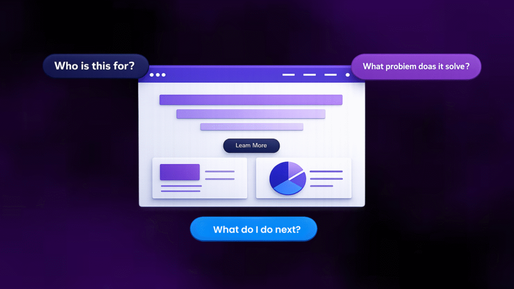
Your cybersecurity website design should answer three questions above the fold:
Who is this exactly for?
What problem does it exactly solve?
What should they do next?
If your homepage design cannot answer those in three seconds, it is not working in your favor.
2. Your Visual Language Don’t Match Your Authority
For several years, cybersecurity websites have defaulted to the same aesthetic: dark backgrounds, neon greens and blues, shield icons, lock graphics, and Matrix-inspired imagery.
The assumption was that “dark and techy” equals “secure and serious.”
But in 2026, this is the reality: your color palette makes or breaks your brand.
A GRC platform can’t use dark neon gradients when the expectation is to bring order, clarity, and audit readiness.
An MSSP, targeting mid-market healthcare companies, that looks like an offensive security lab is sending a wrong signal.
As we covered in our blog about cybersecurity website design framework, your theme should reflect your product category and your buyer’s expectations.
Compliance platforms show clarity with light, clean, and document-friendly design. AI-driven detection platforms can use dark gradients, but only with restraint.
Pentesting firms can go technical, but more often than not, they become chaotic.
Most of the time, the visual language on cybersecurity websites contradicts the positioning or doesn’t say anything about the positioning.
The visitor’s eyes see one thing, your copy says something else, and then the visitor gets put off and goes off the page.
3. Your Pages Are Just Walls of Text
Cybersecurity founders are technical people. They know their domain deeply. And that depth often translates into pages that are dense, long, paragraph-heavy, and visually exhausting.
There is hardly any visual cues that break up the sections. No diagrams that can explain the text in a simplified manner.
No visual hierarchy that tells the eye where to go next. Just block after block of 14px text that demands focus from a visitor who is probably evaluating three other vendors simultaneously.
Good cybersecurity website design uses visual elements as tools for better communication. Visual elements are a way to give your readers a much-needed break and explain them the text in an easier manner.
For example, when a website is talking about pentesting it can show a pentest process as a four-step illustrated flow.
Or they can show a SOC 2 readiness timeline as a horizontal visual with milestones.
Or a network security architecture as a clean diagram instead of three paragraphs of technical descriptions.
And the goal isn’t really to simplify the technical details too much. But then you should understand that the attention span of your reader isn’t very low, and therefore you need to make the information just scannable.
If your page requires them to read every word to understand what you do, you will lose to the competitor whose page lets them understand the same thing in a ten-second scan.
4. Your Websote Doesn’t Talk About the Buyer’s Problem
This is one of the most common failures on cybersecurity websites, and it is particularly damaging because it affects your highest-intent pages – the pages a visitor lands on when they are actively evaluating you as a vendor.
Here is what most cybersecurity service pages look like: a heading (“Penetration Testing”), a paragraph listing scope areas (web apps, APIs, networks, cloud), maybe a bullet list of methodologies (OWASP, PTES), and a “Contact Us” button at the bottom.
It is hard to understand how that is different from a services brochure.
What is missing is the buyer’s context. Who are you really writing this for?
A service page that converts does not just say what you do. It shows how what you do solves a specific problem for a very very specific buyer.
The website design best practices for cybersecurity service pages require a visual structure that walks the buyer through the engagement – from problem recognition to scope to process to output to next step.
If the design of your service pages does not take the visitor on that journey, it is really of no use.
5. You Have No Social Proof
We are not talking about having a dedicated “Testimonials” page buried in your navigation. We are talking about the complete absence of trust signals at the exact moments a visitor is deciding whether to trust you.
Most cybersecurity websites either have no social proof at all, or they have a few client logos on the homepage footer and nothing else.
To be fair, social proof for a cybersecurity website is tricky. A lot of the times, the vendors are obligated under their NDAs to not mention anything about their engagement or the work done.
Yet, there are creative (and anonymous) ways to make sure your work and your exposure gets highlighted enough.
But if you can mention your work, you should.
In such scenarios, social proof needs to be designed into the page at decision points.
On a service page, next to the CTA.
On the homepage, right after your value proposition.
On a pricing or “get started” page, where buyer hesitation is highest.
And it needs to be specific to cybersecurity buyers.
And the testimonial should also be highly specific. A testimonial from a CISO that says, “They scoped our pentest in 48 hours and helped us clear our SOC 2 audit three weeks ahead of schedule” is more important than generic “good work done by the team”.
The first one has specificity, credibility, and relevance to the exact buyer you are targeting.
Case study snippets, client logos with industry labels, G2 or Clutch badges, named quotes with job titles – these should not live on a separate page.
They should be structured very visibly into the page hierarchy and should be very obvious for any reader.
Keep these upfront you don’t want to shy away from brand promotion.
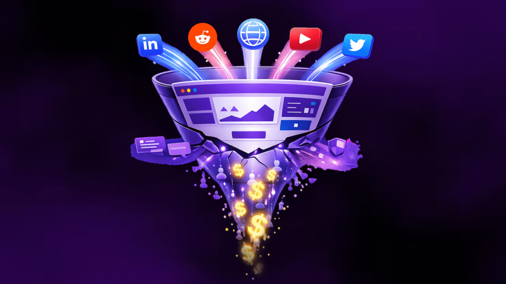
6. Your Website Has No Lead Magnets
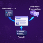
A typical visitor journey looks like this on most cybersecurity websites: they arrive from a Google search or a LinkedIn post, read a blog or skim the homepage, and then have two or three options – leave immediately, read furter, or immediately fill out a “Contact Us” form.
This is a simple cybersecurity marketing strategy failure that gets avoided for various reasons.
Your website doesn’t include any mechanism for capturing interest from visitors who are not yet ready to talk to sales but are clearly interested in what you do.
Lead magnets are the missing element.
Maybe a compliance assessment checklist, or a sample VAPT report, or a short explainer on the regulatory complexity for a particular use-case or anything that you’d like to give to your audience, without any obligation.
These marketing resources are your assets to create that first important touchpoint with your audience.
They should be visually integrated into your page layout – as in-content banners, sidebar widgets, exit-intent overlays, or section-end CTAs.
If your page design has no room for a lead magnet, it has no mechanism for capturing mid-funnel intent.
And that means you are only converting the 2–3% of visitors who are ready to buy right now, while letting the other 97% walk away.
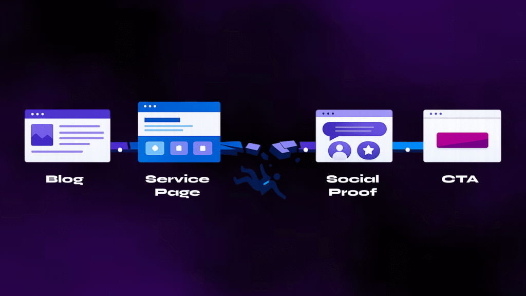
7. Your Pages & Blogs Lack Good Interlinkages
This is a design and architecture problem that silently drains the value of every page or blog post you publish.
The website overall is made for one and only one thing – inform and convert your prospect to buy from you. I know the sales cycle it way too long to see this process work out smoothly.
But this process gets way too long either because of lack of information on the website or just no real interlinkages between different sections of the site.
A typical cybersecurity website has content existing like separate islands.
A visitor reads your post on “What is SOC 2?”, finds it helpful, and then has no designed next step that connects them to your SOC 2 compliance service page.
Or your product or solutions pages give a deep-down about the use-cases but don’t really connect to the use-cases being shown in action or any case studies to refer to.
Ideally, your cybersecurity website funnel should work like this:
a blog post answers the buyer’s question (top of funnel),
a contextual CTA or in-content link guides them to a service page or comparison page (middle of funnel), and
the service page presents the offer with social proof and a clear CTA (bottom of funnel).
Each step should be visually designed in a way that you set the right mood for the reader to come and talk to you.
8. Your CTAs Are Generic, Misplaced, or Completely Missing
You don’t need to visit ten cybersecurity websites and find that they are using the same CTA patterns: a single “Contact Us” button in the top nav, maybe a “Request a Demo” on the homepage hero, and then nothing else.
Or worse, every page has “Learn More” – which tells the visitor absolutely nothing about what happens when they click.
And even worse, the CTAs which don’t go anywhere.
Effective CTAs in cybersecurity website design are contextual, specific, and placed at decision points throughout the page.
CTAs on case-studies pages should ask the read to download the case study, those on the home page should either read “Contact Us” or “Book a Call” and those on the service pages should guide them to “Explore Use-Cases”.
The design of the CTAs should be visually distinct – contrasting colour, adequate padding, strategic placement after value-building sections.
They should not be buried below five scrolls of text. They should appear where the reader’s intent naturally peaks: after you have explained the problem, after you have shown how you solve it, and after you have proven it with social proof.
9. Your Website Doesn’t Show You As An Expert
Don’t get me wrong. Your website might show your authority in the field and your exposure very well. But quite often, it shows a lot of services & solutions diluting your expertise in any 1 or 2 domains.
Many cybersecurity companies serve multiple buyer segments and provide multiple services – enterprise vs. mid-market, compliance buyers vs. security operations teams, CISOs vs. IT managers.
And therefore, the tendency is to put everything you have done on the website without asking the question – “what are we known the best for?” or “which service(s) should be our core offering amongst the 10 we want to list?”
Since, the world of cyber is becoming highly competitive on the vendor side, these questions become important for two reasons –
- Places you as a niche provider in your core service for a very particular audience – so you become the go-to person in at least one service. The rest can be value-added service.
- Allows you to go very deep into the content for the core & niche services you’re targeting – shows the audience tremendous depth in your understanding.
With the authority you have in the industry, it makes more sense to be highly specific with your offerings instead of diversifying at the risk of losing out on your strengths.
10. Your Website Is Disconnected from Your Overall Marketing
This is the most strategic problem on this list, and the one that ties everything else together.
You think of your website as a place where the final push takes place before the demo call or the first interaction with the prospect.
But your entire marketing strategy isn’t just about the website – it also includes your LinkedIn and other social media channels, your physical marketing collaterals, your team identity, your conference presentations, and your overall brand identity.
Yet the website at times talks very differently from your LinkedIn or your YouTube or your conference brochure.
Technically, your website should be the hub of your cybersecurity GTM engine. When a CISO gets your cold email, the first thing they do is check your website.
When they see the founder’s LinkedIn post, they click through to your website.
When they meet you at a conference, they visit your website that night. Every GTM touchpoint eventually points back to the website.
If your outbound email talks about “reducing audit prep time by 60%” but your homepage instead says nothing about audit prep time, you’d lose the reader’s interest.
If your LinkedIn content focuses on GRC for SaaS startups but your website looks like it is built for Fortune 500 security teams, then your LinkedIn won’t eventually generate credibility.
Your website’s visual design, messaging hierarchy, page structure, and CTAs should be built as extensions of your cybersecurity marketing strategy – not as a separate project managed by someone who doesn’t know about your brand identity.
Your Website Is Supposed to Increase Trust
Cybersecurity buying is a lot less like any other buying decisions.
It involves a lot of risk evaluation and at times a lot of convincing decision makers who don’t care about technicalities.
Every element of your website — the hero section, the colour palette, the page structure, the social proof, the CTAs, the visual density, the lead magnets, the blog-to-service pathways – needs to add credibility to your brand. There is no doubt about it.
In fact, if your website doesn’t have much of it, it’s better to not have any of it. (Kidding! Don’t listen to this advice)
These 10 problems are the most common patterns we see when cybersecurity founders or marketing teams tell us their website “is not converting.”
If you recognise three or more of these problems on your own site, it is worth pausing your next campaign and fixing the foundation first.
No amount of SEO, ad spend, or outbound outreach will compensate for a cybersecurity website that hurts your credibility more than enhancing it.
Think your cybersecurity website might have some of these problems?